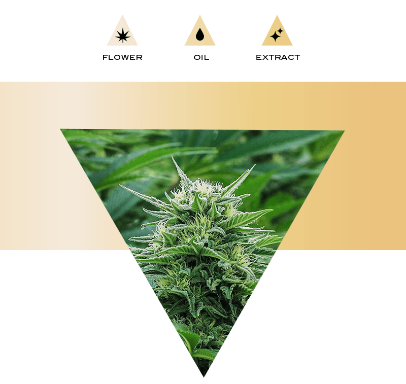
Elyon is an emerging cannabis brand nestled in the vineyards of Sonoma County, California.
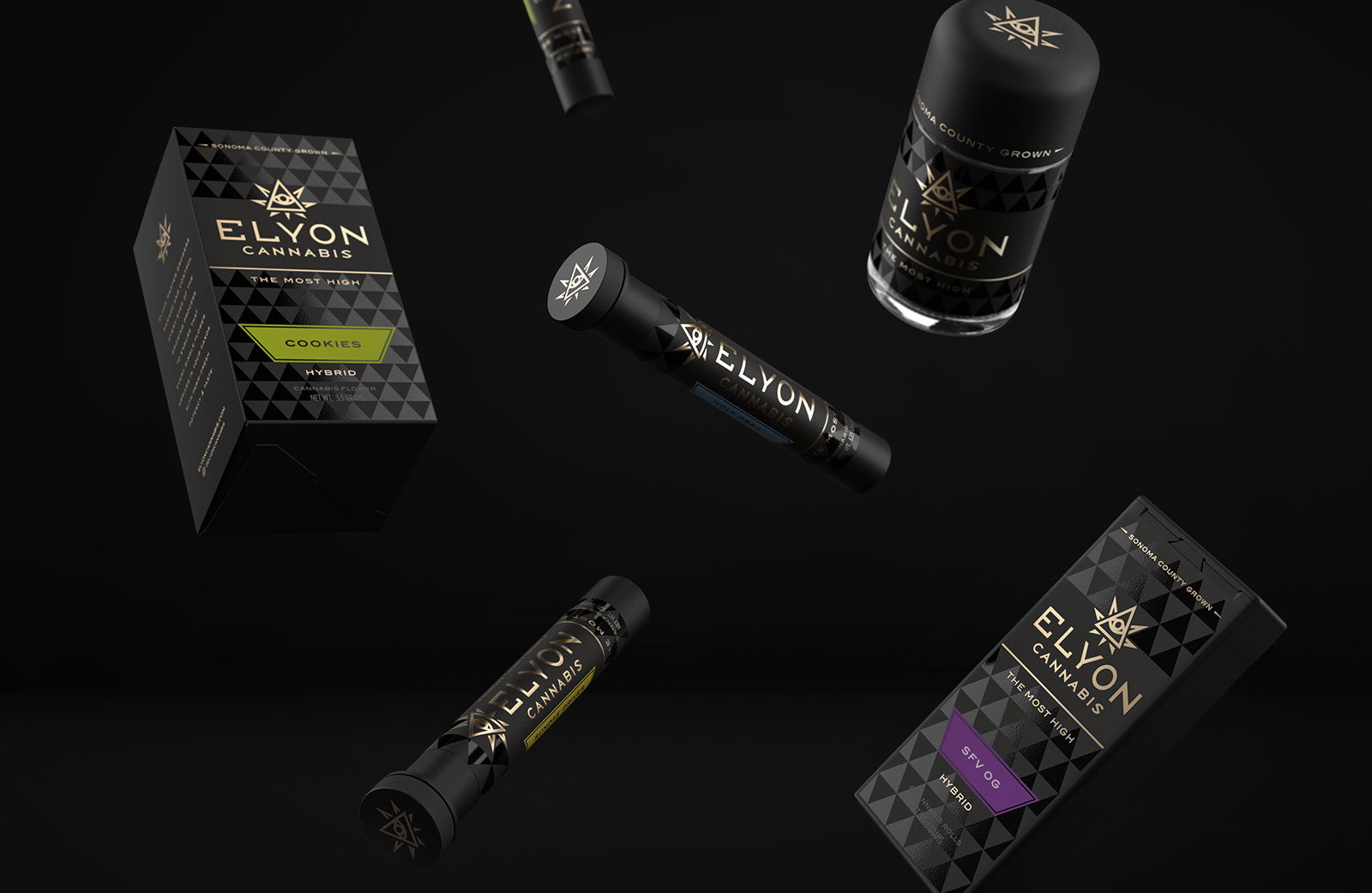
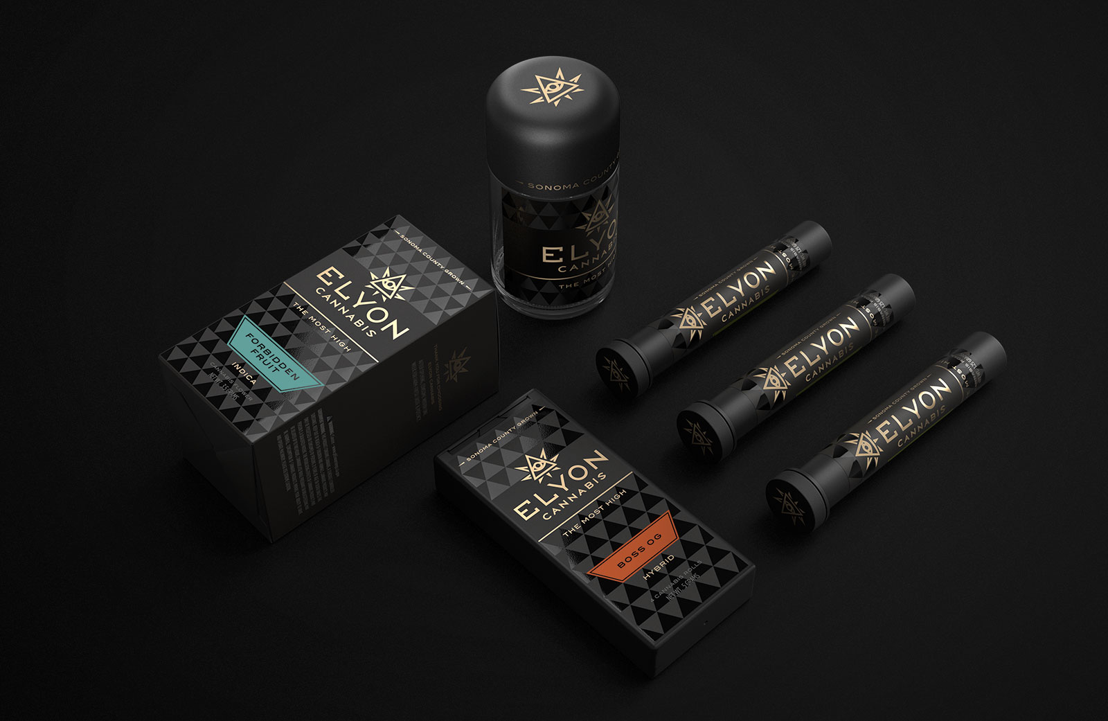
We created the brand identity and packaging design for Elyon Cannabis and their initial product launch.
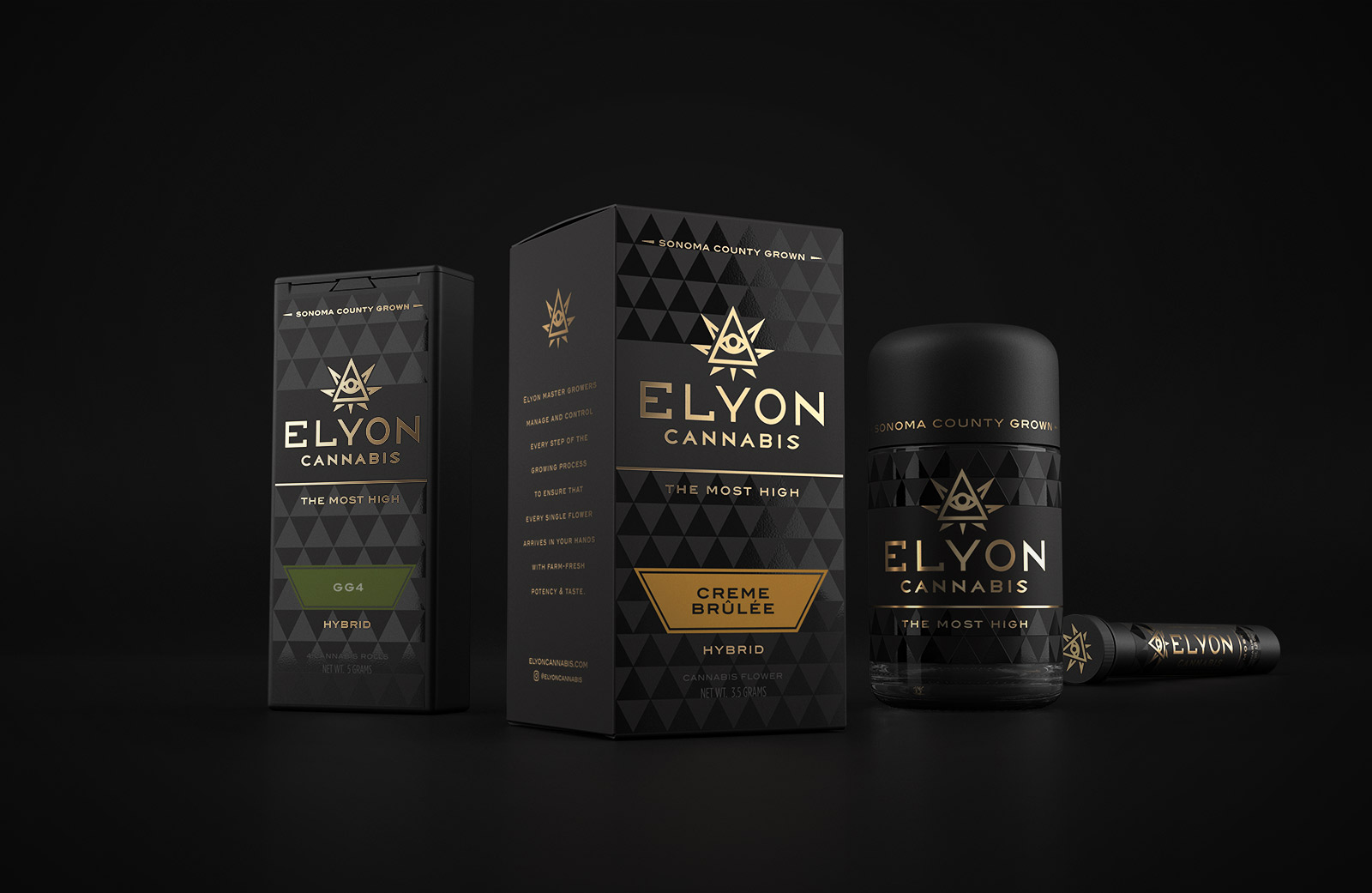
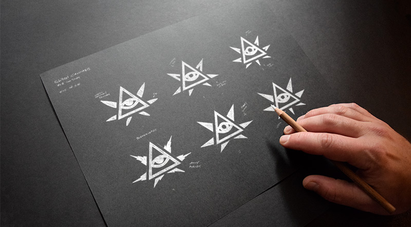
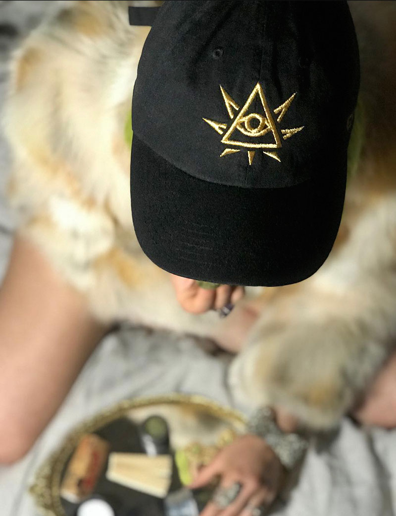
Conceptually this brand was focused on the name Elyon, which is a godly epithet from Biblical Hebrew translating to “most high.” The logomark was created combining a cannabis leaf with the iconic All-Seeing Eye of God, an image often associated with the Illuminati. The rays, typically accenting the Eye, were used as inspiration in incorporating the cannabis leaf. Resulting in a unique, transient mark.


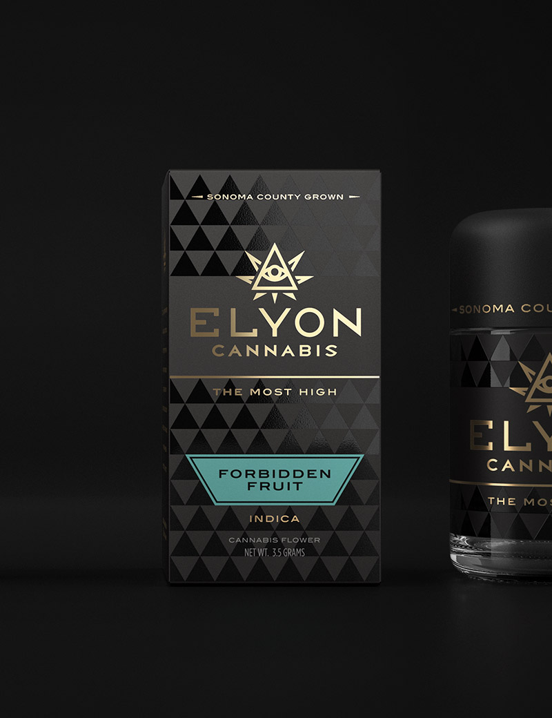
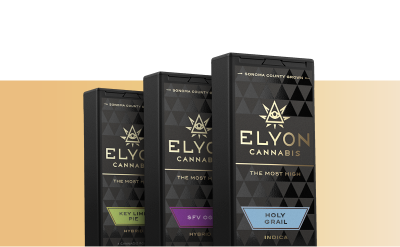
The supporting pattern and design elements, created for the packaging, harken back to the logomark’s sharp angles, establishing a simple yet sophisticated look. The use of gold foil and UV gloss were utilized to enhance the consumer’s experience, while further perpetuating the brand’s esoteric tone.